


















Qingmei Future Insights
The Golden Rule of Logo Design: Simple, but Never Simplistic
The Golden Rule of Logo Design: Simple, but Never Simplistic
LOGO is the visual soul of the brand, carrying the company's core values and brand promise. In the era of information explosion, an excellent LOGO needs to be recognized, understood and remembered in a very short time. "Simple but not simple" is not only the pursuit of design aesthetics, but also the golden rule of LOGO design. How to maintain depth and connotation while cutting out complexity and simplifying it is a core competency that every designer must master.
Strategic Reconstruction of LOGO Design Concept
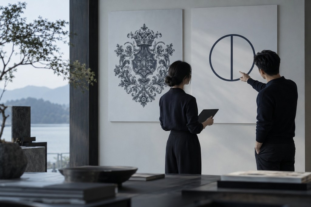
The shift toward simpler logos reflects a deeper understanding of how consumers allocate attention, and a fundamental change in visual communication strategy. The traditional decorative model of "intricate detail, ornate patterns, layered styles" is giving way to a symbolic model of "distill the core, optimize for memory, adapt to context." In this shift, simplicity is no longer a surface-level aesthetic choice. It is a systematic identity strategy that must be planned from the moment a brand defines its positioning.
The core of the modern minimalist logo is a new logic for brand identity. Traditional brands use complex, elaborate graphics to convey substance and design investment. Minimalist logos use highly distilled symbols and restrained visual language to create memorability and communication efficiency. This shift requires brands to move from decorating visuals to distilling symbolic meaning and strategically managing cognitive resources.
A Fundamental Change in Design Thinking: A Philosophy of Adding to Subtracting

Achieving "simple, not simplistic" starts with rethinking the design process. Traditional logo design follows a logic of "creating from nothing": adding elements, details, and ornament to a blank canvas until the visual feels rich enough. Minimal design follows a philosophy of distillation: first exhaust every possible dimension of expression, then systematically remove until every remaining element carries irreplaceable communicative value.
At the core of this design philosophy is maximizing "density of meaning." Every line, curve, and space in a minimalist logo must carry a clear brand message or emotional cue. Nike's Swoosh is not an arbitrary abstract shape, but a dynamic capture of motion, conveying speed, strength, and forward momentum. Apple's apple is not a complete depiction of fruit; the detail of a single "bite" creates a point of memory, suggesting knowledge, innovation, and human-centered technology.
The skill in reduction is knowing what belongs to a brand's core DNA and what is just the decorative noise of its era. Twentieth-century luxury logos favored ornate crests, script lettering, and symmetrical patterns, all of which signaled nobility and exclusivity at the time. Twenty-first-century redesigns have largely stripped these away, keeping only the core letterform or symbol, because the visual context has changed. Small screens, fast scrolling, and fragmented attention demand that a logo be recognized in 0.1 seconds. Fine detail has become a barrier to communication, not a source of value.
Cognitive load theory provides the scientific basis. Human working memory is limited, and processing visual information consumes cognitive resources. A simple logo lowers cognitive load, letting the brain process and store the brand symbol quickly. Research shows that logos with simple shapes, clear contrast, and minimal elements achieve memory retention more than 40% higher than complex logos. Commercially, this means lower brand awareness costs and higher communication ROI.
Geometry as Strategy: From Arbitrary to Structured

Simplicity is not casual minimalism. It is precise design grounded in geometry and mathematical proportion. The most successful simple logos in history follow strict geometric rules: the golden ratio, the Fibonacci sequence, perfect circles, axes of symmetry. These principles evoke harmony and beauty in human perception, forming a universal aesthetic foundation across cultures.
The circle is the most common base shape for minimalist logos. Psychologically, a circle conveys completeness, inclusiveness, and harmony. With no aggressive corners, it suits brands that need to feel approachable. Target's bullseye, Audi's four rings, and Mastercard's two circles are classic logos that draw on the circle's symbolism and geometric simplicity to build strong recognition. The circle has another advantage: it has no direction, so it keeps its form at any angle of rotation and adapts to different applications.
Triangles convey stability, direction, and motion. An upward triangle suggests ambition and drive; a downward one suggests steadiness and grounding. The simplicity of the geometric triangle lies in its irreducibility: three sides are the fewest that can form a closed shape. Reebok's triangle and adidas's three stripes (which imply a triangular structure) use this geometric archetype to convey the energy and strength of a sports brand.
Squares and rectangles convey order, professionalism, and reliability. Right angles and parallel lines create a sense of regularity and rationality, suited to industries that need to signal expertise, such as technology, finance, and architecture. Microsoft's window and Adobe's framed A are both built on square geometry, reinforcing each brand's technical character and systems thinking.
Strategic use of negative space is an advanced technique in minimalist design. The arrow hidden between the E and x in FedEx, the smile-shaped arrow from A to Z beneath the Amazon logo, the two figures hidden in Hilton's H: at first glance these are simple letters or shapes, but a closer look reveals hidden layers of meaning. This "double reading" creates a memory hook and a reason to share, making a minimalist logo both memorable and rewarding to revisit.
Minimalism in Color: From Many Colors to the Power of One
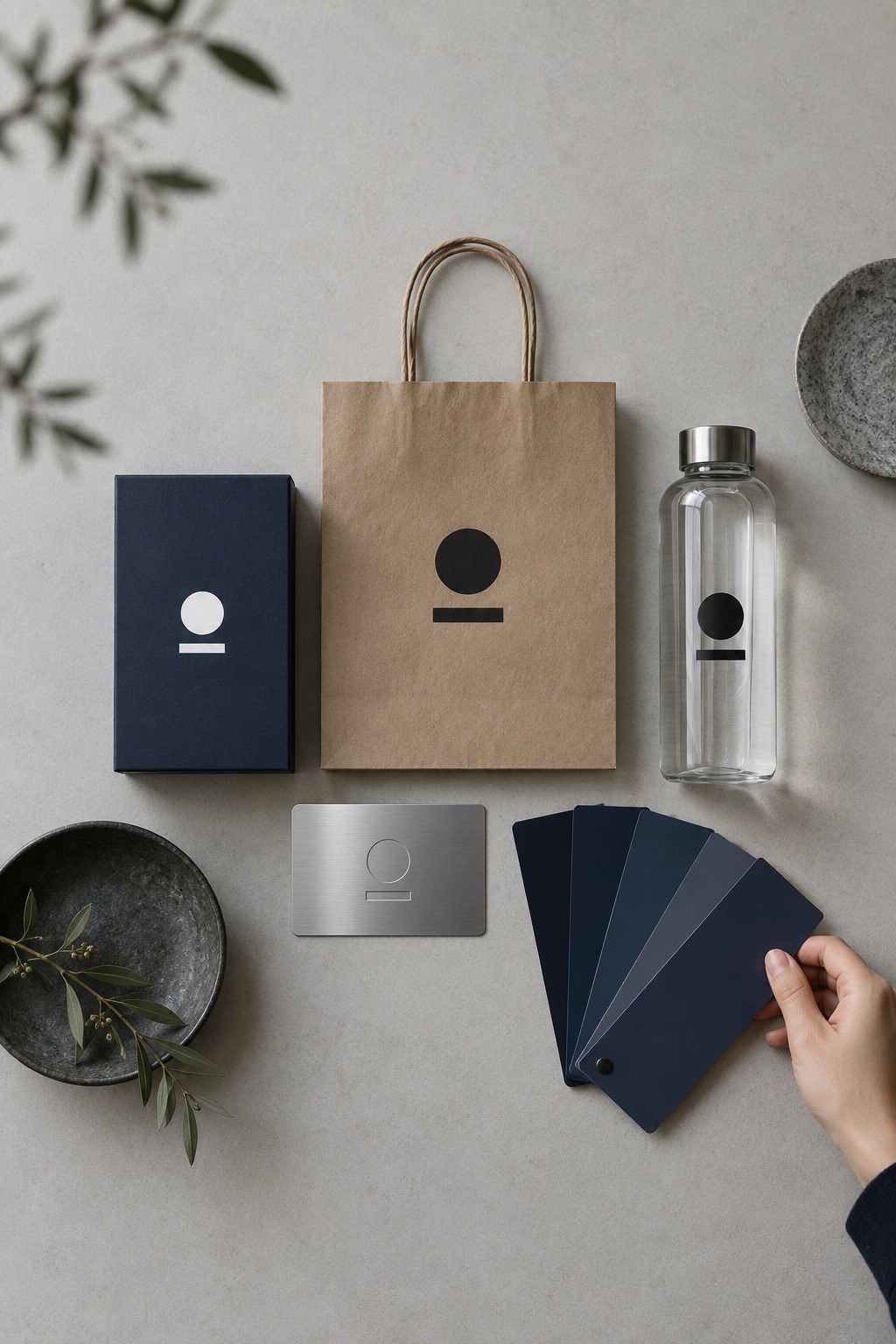
Color strategy for a simple logo follows the principle that "less is more." A one- or two-color palette is not a design compromise but a strategic choice for stronger recognition. The fewer the colors, the easier it is to keep the brand consistent, the lower the cost of reproduction across media, and the less noise stands between the brand and memory.
A monochrome logo is the most adaptable. In black and white, it can be printed on any background or material without losing recognition, which makes it highly practical across contexts. Chanel's interlocking Cs, Nike's Swoosh, and Apple's apple all stay fully recognizable in pure black or pure white. This independence from color is a mark of design maturity.
When color is used, minimalist logos tend toward a single primary color. Coca-Cola red, Tiffany blue, McDonald's golden yellow: these brands have built powerful visual ownership by making a color their own. A single-color strategy lets a brand "own" a hue, creating a direct link between color and brand in the consumer's mind. See the color, think of the brand. It is a level of recognition that multicolor schemes rarely achieve.
Systematic Consideration: From a Single Medium to Every Touchpoint

The digital era greatly amplifies the strategic value of simplicity. A logo no longer lives only on business cards and storefront signs; it must stay recognizable across dozens of sizes and contexts, from website favicons and app icons to social avatars, smartwatch screens, and AR glasses interfaces. Complex logos lose detail and blur at small sizes, while a simple logo stays clear even in a 16×16-pixel favicon.
Responsive logo design extends the principle of simplicity. A brand creates a tiered logo system, from full version to simplified. The full version, with the brand name and complete mark, is used at large sizes and in formal settings. The simplified version drops the wordmark and keeps the symbol for medium sizes. The icon version reduces the mark to its most essential element for small sizes. This tiered system maintains brand consistency while ensuring optimal recognition in every context.
Motion adaptability is a specific demand of digital media. The geometric clarity of a minimal logo makes it easier to animate. Entrance animations, loading states, and interactive feedback can look cluttered on a complex logo but reinforce memorability on a simple one. Google's four-color letterforms and Android's green robot both animate fluidly because of their simplicity.
Strategic Investment in Long-Term Value: From Trend to Classic

The lasting value of a simple logo is its stability over time. Design trends shift every decade; ornate logos date quickly and need frequent updates to stay current. By stripping away period-specific ornament and keeping a timeless geometric and symbolic core, a simple logo can stay modern for decades.
Building brand equity requires long-term consistency in identity. Every major logo change partially discards past brand investment and forces consumers to learn and remember a new symbol. A minimal logo, designed right the first time, creates an identity that can last for decades, so every marketing dollar builds brand equity instead of resetting it.
This is the strategy behind minimalist logo design: let reduction create value, let restraint release strength, and let simplicity carry a brand ambition that is anything but simple.
Conclusion
"Simple but not simple" in LOGO design is a manifestation of a design philosophy, which requires designers to have deep skills and keen insight. Through the discussion in this article, we see that true simplicity is the essence of refinement, and every line and every space has been carefully considered. Behind the simplicity lies a deep understanding of the essence of the brand and precise control of the design language.
In design practice, designers need to learn to do subtraction and have the courage to discard redundant decorations and complex elements. But simplification does not mean simplification. It is necessary to inject the uniqueness and memory points of the brand into simplicity. At the same time, it is necessary to ensure that the LOGO is adaptable in various application scenarios, from business cards to giant advertisements, from printing to digital media, and can maintain clear recognition.
Times are changing and aesthetics are changing, but the simple design concept remains timeless. From Bauhaus to modernism, from Apple to Nike, countless classic LOGOs prove the eternal charm of simple design. Let us continue to explore the boundaries of simplicity, and under the guidance of the concept of "less is more", create a LOGO that is both simple, powerful and profound, and create an eternal visual symbol for the brand.