


















Qingmei Future Insights
Brand Element Integration in App Interfaces
Brand Element Integration in App Interfaces
Social media has become the main battlefield for brand communication. The characteristics of different platforms and user groups have brought huge challenges to the unity of brand image. How to adapt to the content forms and communication rules of each platform while maintaining the core identity of the brand has become a key issue in brand digital communication. Uniformity does not mean uniformity, and brands need to find a smart balance between consistency and flexibility.
This article will provide an in-depth analysis of the strategies and methods of social media brand image uniformity design, from the formulation of visual specifications to the development of content templates, from cross-platform collaboration to localized adaptation, to provide brands with practical guidelines for maintaining image consistency in a diversified social media environment.
Rethinking Brand Integration Strategy
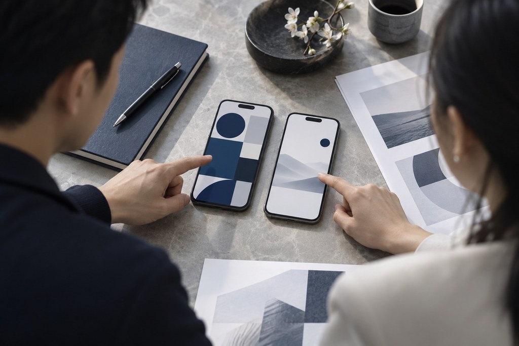
The evolution of brand integration in app interfaces reflects a deeper understanding of brand value in product design, and a fundamental shift in user experience strategy. The traditional overt model, “pile on logos, flood with color, force exposure,” is giving way to a subtle one: “blend into the experience, build emotional connection, enable subconscious recognition.” In this shift, brand elements are no longer decorative symbols on the screen. They are a systematic carrier of identity, planned from the start of product experience design.
The core of modern in-app branding is a new logic for how a brand is presented. Traditional apps build recognition by repeatedly placing the logo and brand colors in prominent positions. Experiential integration weaves brand DNA into interaction details and emotional touchpoints, creating brand memory that forms quietly over time. This shift requires brands to move from pursuing visual exposure to shaping user experience and designing emotional connection.
The Integration Mindset: A Paradigm Shift from Interruption to Integration

Integrating brand elements effectively starts with rethinking the logic of integration. Traditional brand presentation follows "advertising thinking": inserting brand exposure into the user flow, such as a full-screen logo on launch, a brand bar at the top of the page, or a brand message after a task is complete. Modern integration follows "experience thinking": the brand never interrupts the user's task, but becomes a natural part of how it gets done.
Restraint is the first rule of integration. Piling on brand elements causes visual fatigue and resistance, lowering rather than raising brand affinity. The best apps keep brand elements restrained on core functional screens: the logo sits in a fixed position that doesn't interfere with use, the brand color serves as an accent rather than a large fill, and brand graphics act as subtle details rather than primary content. In Airbnb's interface, the brand red appears only on key buttons and selected states, with generous white and light gray creating a sense of space. Spotify reserves its green mainly for playback controls and the brand mark, keeping content browsing areas in neutral black, white, and gray.
Function first keeps the brand in service of the user's goals. Every appearance of a brand element must pass one test: does it help the user complete the task? Does the brand icon in the navigation bar help users recognize the app at a glance? Does the brand-colored button guide users through key actions? Does the brand graphic in the background improve readability? Only elements that support function should stay. Anything that exists purely for exposure should go.
Emotional design turns a brand from a visual symbol into an emotional touchpoint. Brand elements are not cold logo placements but design details that carry emotional value. When a user completes a milestone, the brand mascot appears to celebrate. On holidays, brand colors take on festive accents. When a user runs into trouble, the brand becomes a helpful guide. These moments tell users "this brand cares about me and understands me," building a connection beyond function.
Layered Integration of Visual Elements: From Surface to Depth

Integrating brand elements into an app interface is not a single layer of visual presentation. It is a multi-layered system, from surface decoration to core brand DNA. Each layer plays a different role in brand communication, and together they create a complete brand experience.
Launch and idle screens are the right place for overt brand expression. App launch screens, empty states, and loading screens are non-core moments that can carry more visible brand elements: the full logo, the brand slogan, brand illustrations. With no urgent task at hand, users are more receptive to brand messages in these moments. The key is to make them engaging rather than tedious, with creative loading animations, witty empty-state copy, and well-crafted holiday launch screens, so brand exposure feels like a pleasure rather than a wait.
Color carries brand DNA into the subconscious. The primary brand color serves as the app's accent, applied systematically to key interactive elements—primary buttons, selected states, progress indicators, and link text. With repeated exposure, users form a subconscious association—"this color = this brand"—even without noticing the logo. Meituan's yellow, Ele.me's blue, DiDi's orange: users link the color to the brand instinctively. This bond runs deeper than any logo placement.
Graphic language expresses brand personality in the details. A brand's distinctive graphic elements, such as geometric shapes, line styles, and illustration traits, recur across icons, dividers, background textures, and empty-state illustrations. These details form a consistent visual rhythm that gives the entire app the brand's character. Alipay's repeated use of rounded rectangles conveys security and stability. Instagram's circular avatars and rounded-square cards create a sense of social warmth. This consistency in graphic language reinforces brand recognition at the level of detail.
Motion design expresses brand personality in time. A brand defines its own motion language: the speed curves of animation, the paths of transitions, the elasticity of feedback. Whether page changes are quick and crisp or calm and graceful, whether a button responds sharply or bounces playfully, these details convey character. Precise, fluid motion signals professionalism for tech brands; soft, elegant motion conveys refinement for fashion brands. This motion DNA often shapes emotional experience more than a static logo can.
Brand design of interactive experience: upgrading from function to emotion

The most advanced form of brand integration weaves brand values into the user's interactions and emotional journey. When people no longer just "see" a brand but "feel" it, real brand affinity takes hold.
Brand personality in feedback gives an app life and warmth. Encouragement on success, reassurance on error, a celebratory animation when a task is done—this feedback isn't a cold system message but a conversation between brand and user. Duolingo's owl cheers when users finish a lesson and pleads tearfully when they miss one; Nike Training Club applauds users with motivating words when they complete a workout. Feedback like this makes users feel they're not using a tool, but interacting with a brand companion that has personality and feeling.
Brand storytelling in onboarding turns feature explanations into a brand narrative. Onboarding is not a dry list of features. It is a story of how the brand helps users reach their goals. A brand mascot guides users through features, user stories show the app's value, and interactive demos let users experience the brand promise firsthand. This approach teaches features while conveying brand values, so users understand what the brand stands for from the first interaction.
Moments of surprise give a brand a sense of ritual and create lasting memories. A personal birthday page, a badge ceremony for an achievement, an animation marking a usage milestone. These carefully designed moments show users the brand's care and attention. They often become content users share, turning into word of mouth.
Systematic Technical Support: From Static Assets to Dynamic Management

Integrating brand elements into an app requires the right technical architecture and governance. No matter how refined the design, inaccurate implementation or weak governance will undermine brand consistency.
A component-based design system is the foundation of brand consistency. Every branded UI element, including buttons, cards, forms, and navigation, is packaged into a standard component library with clear rules for brand color, typography, graphics, and motion. Developers build interfaces from the library instead of rewriting styles each time, so every brand element meets the design standard. Connecting design tools like Figma and Sketch with development frameworks like React and Flutter keeps brand guidelines in sync across design and development.
Parameterized theme configuration makes the brand flexible. Color, typography, corner radius, and spacing are defined as global variables and managed in a single configuration file. When the brand evolves, updating the parameters refreshes the entire app at once, with no page-by-page edits. The same architecture supports multiple themes — standard, holiday, and co-branded — switched instantly through configuration.
Automated brand checks prevent guideline violations. Brand compliance tools built into the CI/CD pipeline automatically scan code for how brand elements are used: whether color values match the brand palette, whether font sizes follow the type system, and whether the logo appears at specified sizes. Non-compliant code is flagged on commit and must be fixed before it can be merged. Automated review turns brand governance from manual spot checks into a systemic safeguard.
This is the strategy behind integrating brand elements into app interfaces: let integration replace interruption, let experience carry the brand, and let details accumulate into a lasting brand impression in the user's mind.
Conclusion
The unified design of social media brand image is a required course for brand management in the digital era. Through the analysis of this article, we see that unity is not a mechanical copy and paste, but an intelligent adaptation to the characteristics of different platforms on the basis of maintaining the core visual genes of the brand. A successful unified strategy can enable the brand to form strong recognition and memory points in the fragmented social media environment.
At the execution level, brands need to establish flexible design systems and efficient content production processes. Through modular design and intelligent tools, we improve content production efficiency while ensuring quality consistency. At the same time, a complete monitoring mechanism must be established to promptly discover and correct content that deviates from the brand image and maintain the integrity of the brand image.
Looking forward, as social media platforms continue to emerge and feature innovations, brands will face more complex uniformity challenges. New forms such as short videos, live broadcasts, and virtual reality require brands to explore new ways of expression. But no matter how the media changes, maintaining the consistency of the brand image is always the basis for building brand equity. Let us help brands maintain a clear, unified and powerful brand voice in the ocean of social media through scientific management and creative design.