
















Qingmei Future Insights
Color Psychology in Brand Design
Build brand colour systems around meaning, recognition, contrast and output conditions, then validate them in actual applications.
Connect colour with brand and context
Review positioning, the category, existing identity assets and audiences. Competitor colours are useful context but do not predict every user’s emotional response. Evaluate candidates in websites, packaging, signage and documents to check recognition and information hierarchy.
Check screen and print applications separately
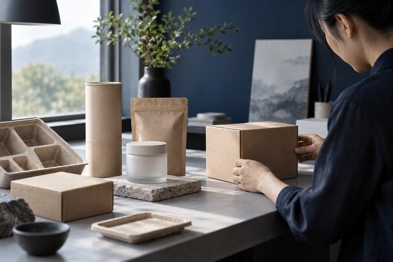
Define combinations for text, buttons, states and backgrounds. Retain text, icons or shapes so colour is not the only signal. Check readability on each background and approve print using actual substrates, finishes and proofs; screen values cannot replace physical samples.
Turn findings into application rules
Document primary and secondary colours, backgrounds, prohibited combinations, file colour modes and approval methods. State tasks, participants, conditions and observations for user testing. Without controlled evidence, do not claim a colour will increase conversion, preference or recall. Refine the system using observed issues.