










Daigao Culture is a comprehensive cultural and creative enterprise with brand planning and cultural communication as its core. Its business covers brand strategy consulting, visual image design, advertising creativity and cultural event planning. It is committed to using high-quality creative services to help enhance the value of corporate brands.
The brand name "Dai Gao" conveys a clear brand attitude - "Dai" means to wear and carry, symbolizing giving the customer's brand a visible and memorable image crown; "Gao" means lofty and high-end, symbolizing the supreme pursuit of creative quality and brand value. Putting the highest crown on the brand is the mission of Daigo Culture. Qingmei Future was commissioned to lead the brand identity design.
The goal of brand logo design is to convey the brand image of "high standards and high standards" through high creativity, cultural taste and professional and refined visual language.
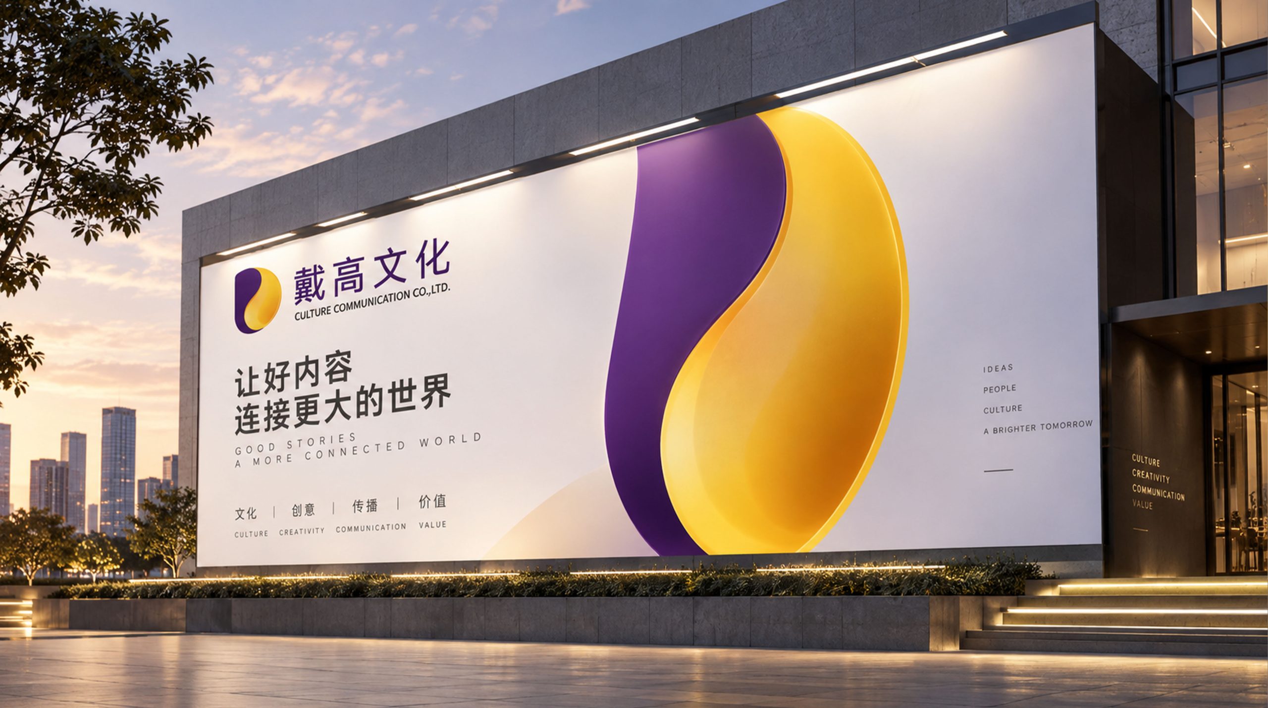
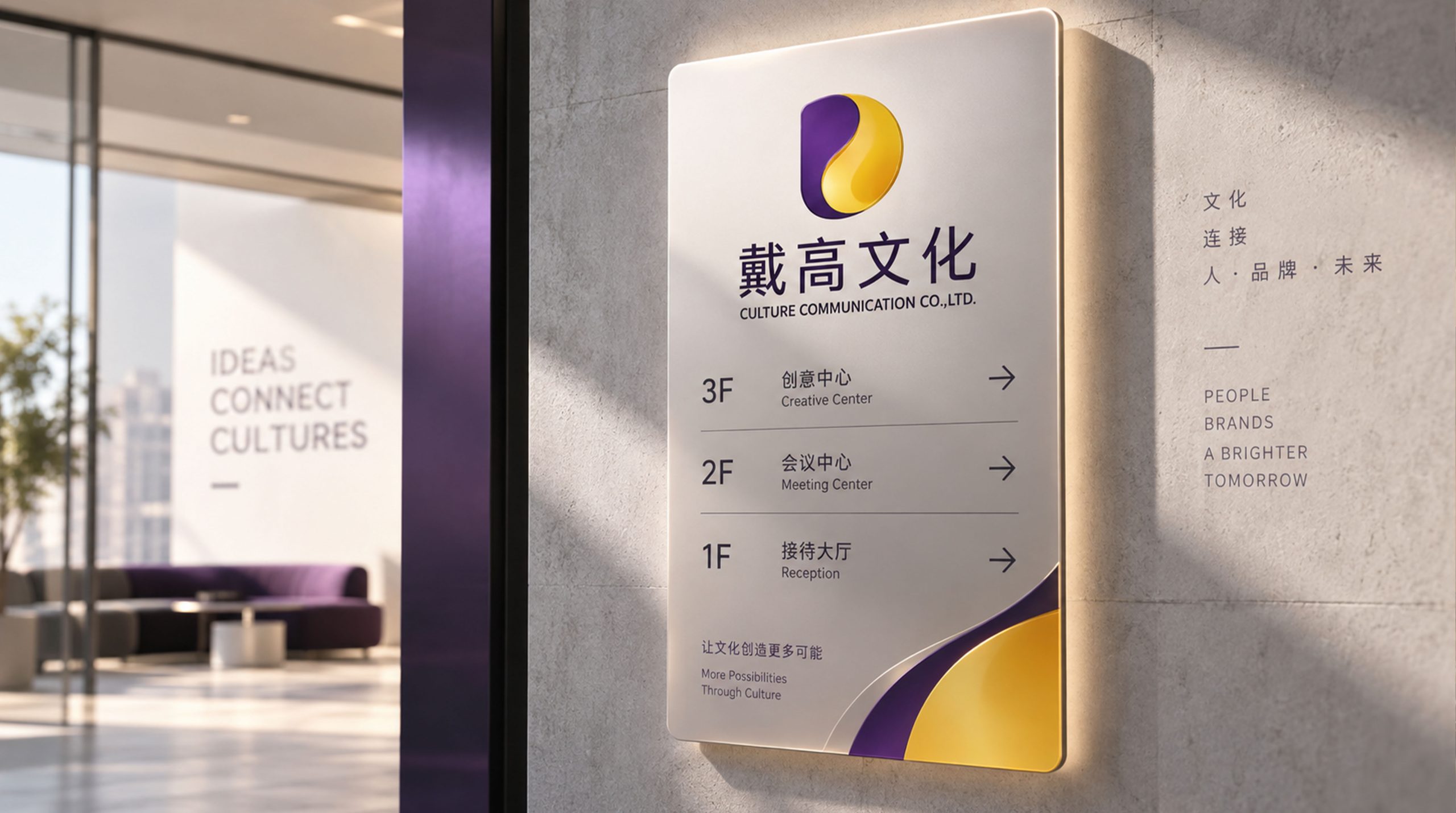
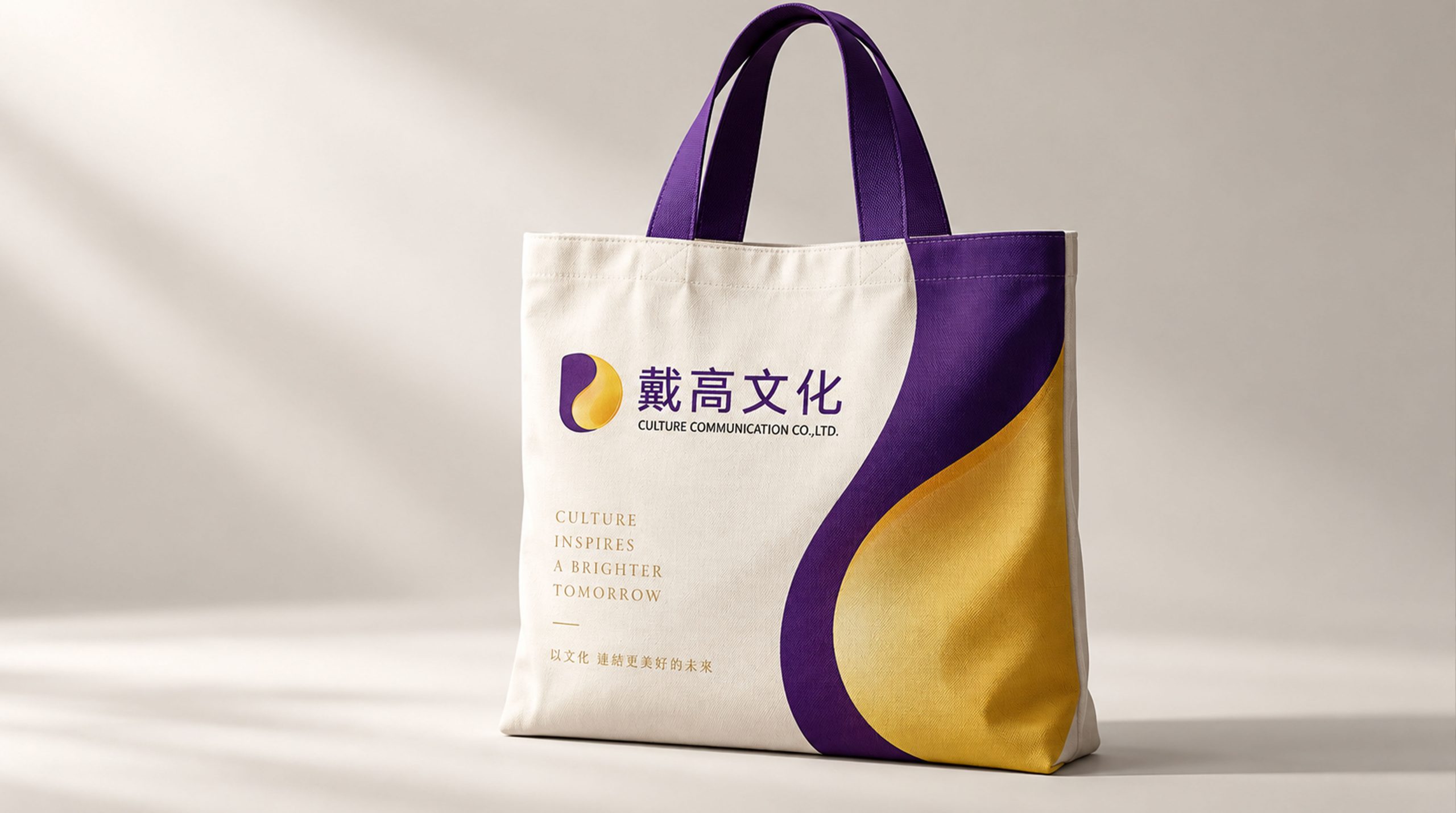
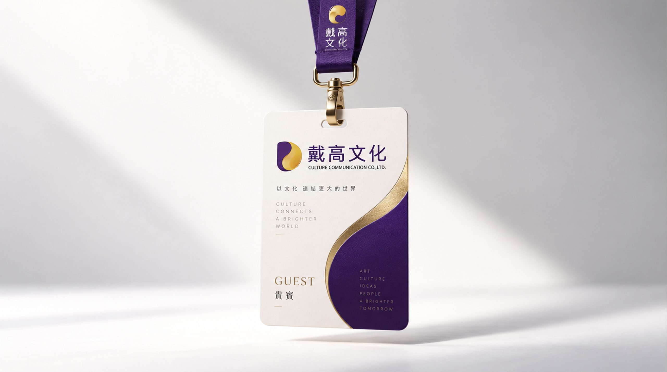
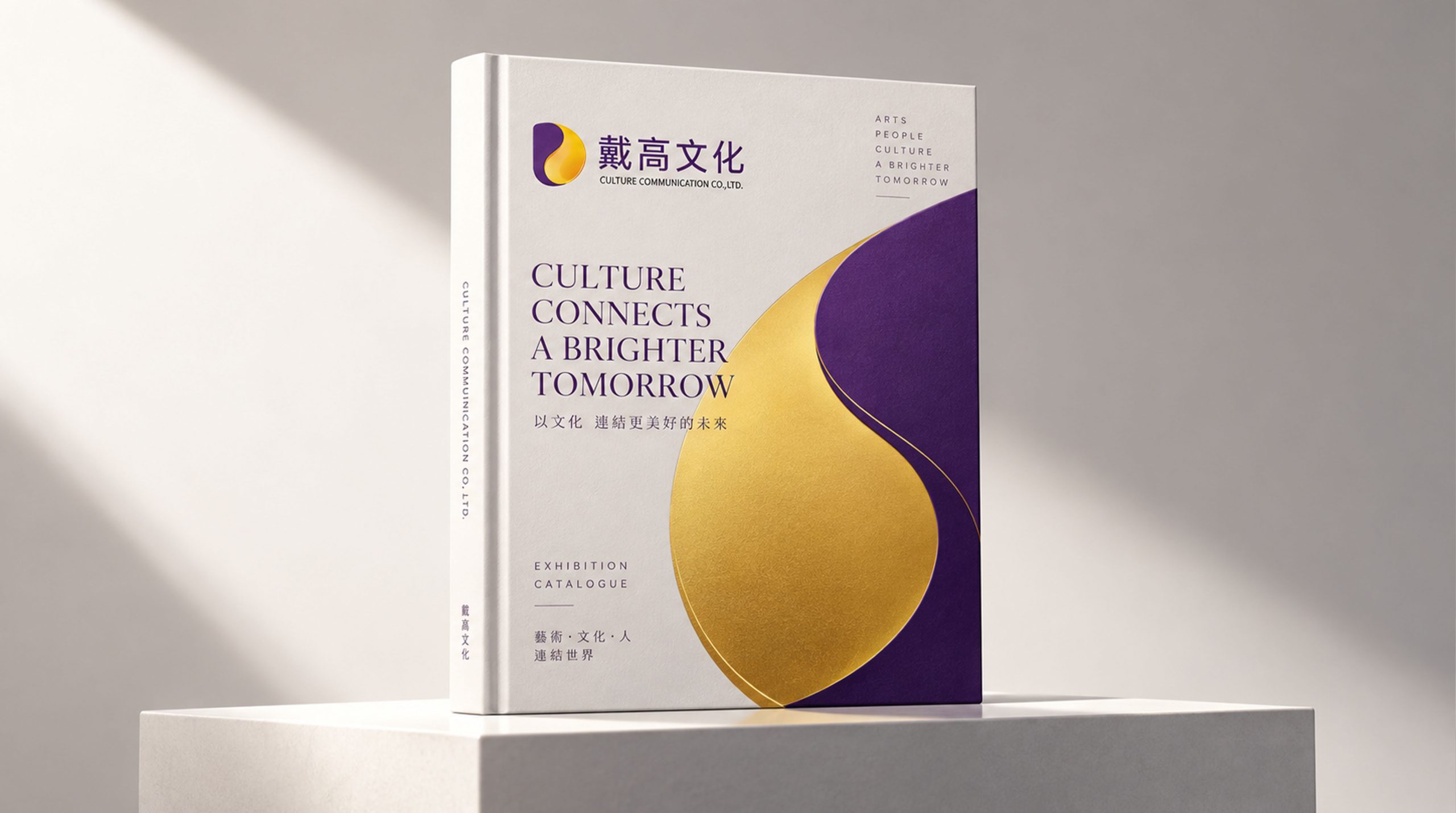
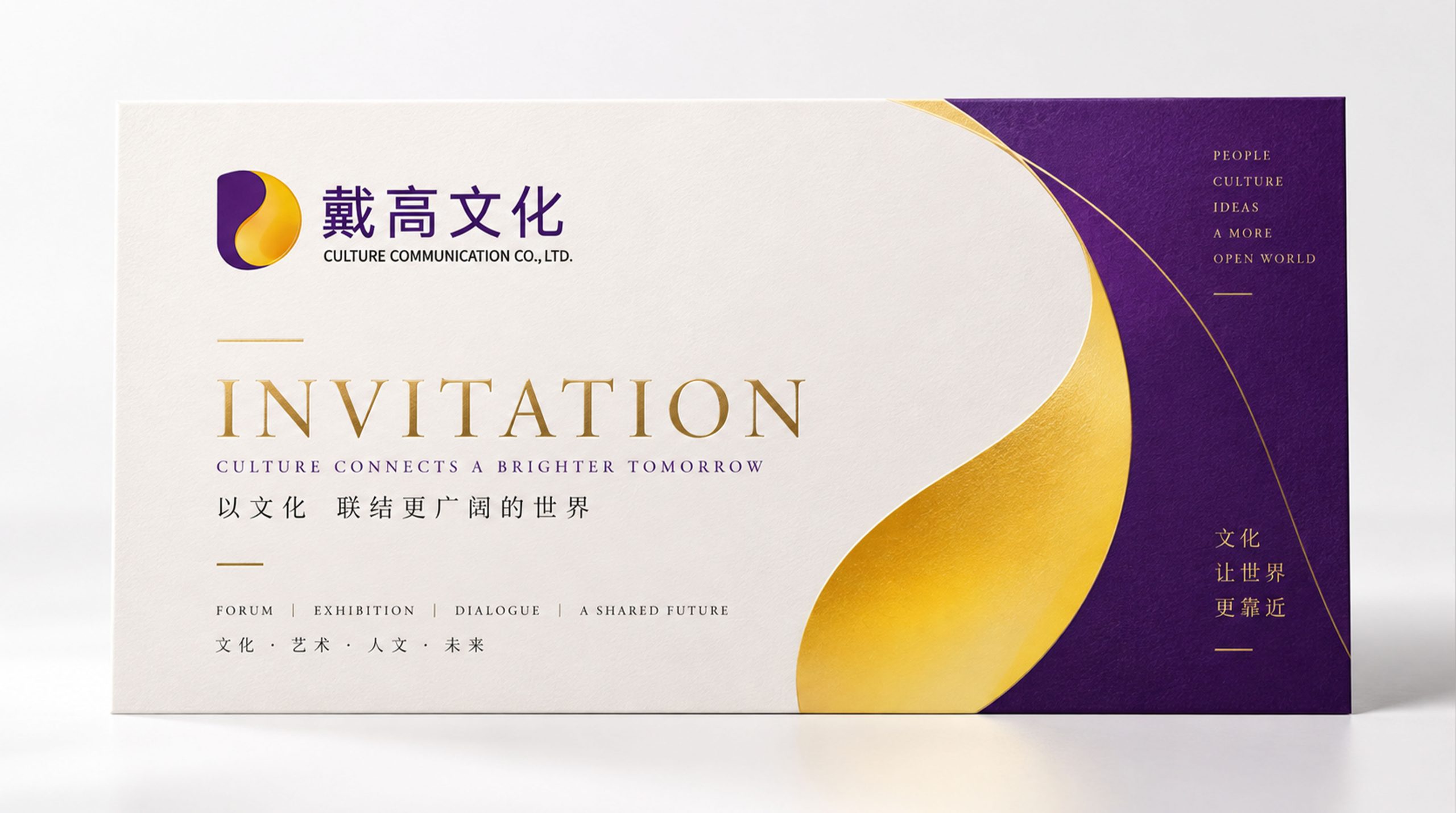
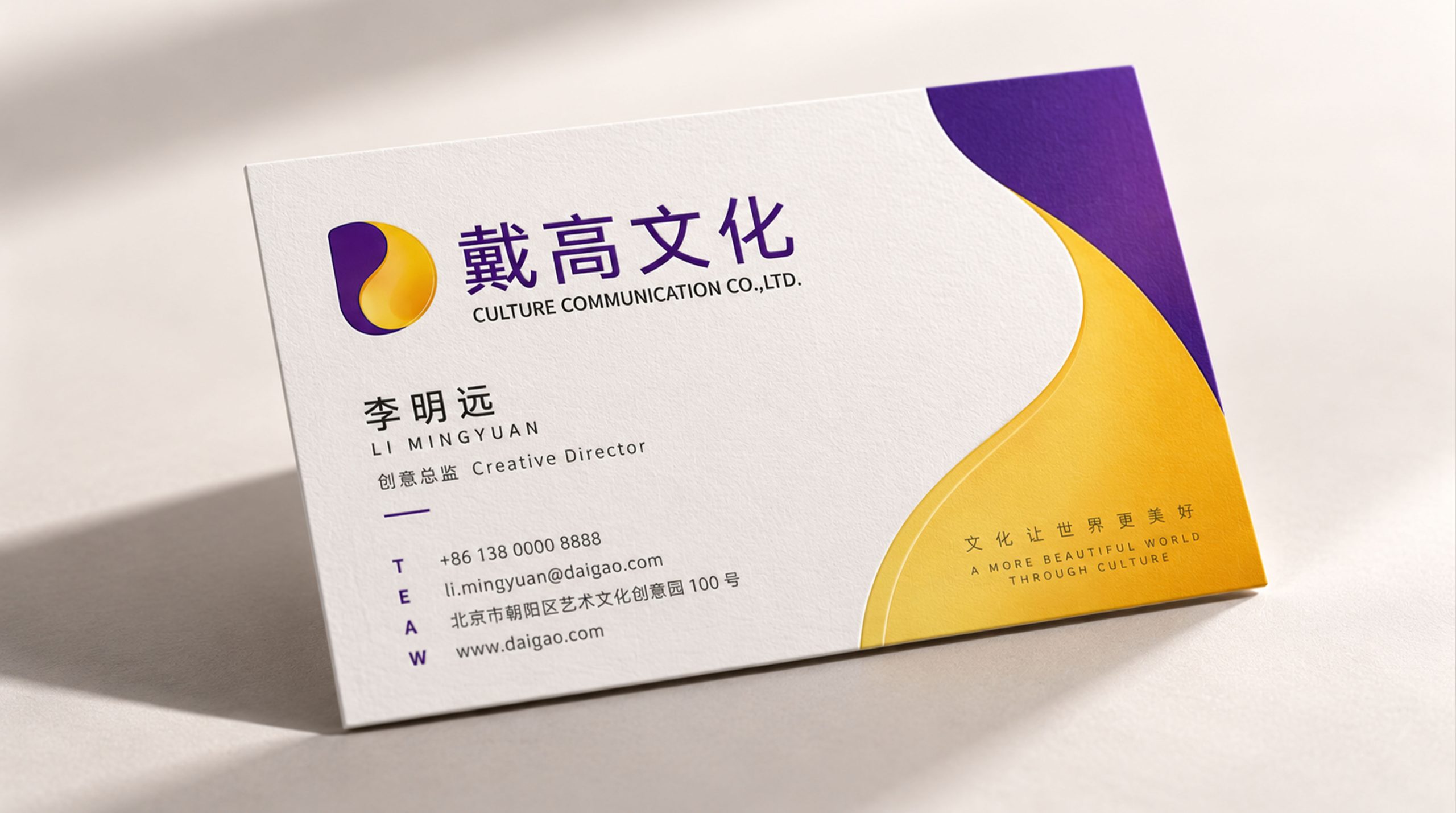
design concept
The logo takes "Crowned Quill" as its core concept, integrating an upward-writing quill with the curved silhouette of the crown. The quill is the most classic symbol in the cultural and creative industry - writing, creation and expression all start from the tip of the pen; the crown is the most intuitive visual embodiment of the "Dai Gao" brand name - worn at the top, supreme. The crown on the end of the pen conveys the service commitment of "crowning the brand with a creative pen".
graphic language
The main body of the graphic uses a slender feather pen as the visual core. The pen body is presented in an elegant oblique posture, tilting from the lower left to the upper right, as if writing is in progress - creativity never stops and inspiration continues to flow. The feathers of the quill pen stretch outward from both sides of the pen barrel in several gentle arcs. The arcs naturally transition from being tight at the barrel to stretching outwards, just like the real texture of feathers, conveying the elegance and delicacy of the cultural and creative industries.
The top of the quill is gathered in an arched arc, which is like the outline of a crown - it is "worn" lightly on the tip of the pen. The crown arc does not have complicated decorations, but uses the simplest arch to convey the image of "high", maintaining a sense of modernity while being elegant. The connection between the crown and the tip of the pen is natural and smooth, just like the quill pen itself has grown a crown - creativity is the crown, and the work is the crowning.
A thin curve or ink mark can be extended from the tip of the pen, just like the smart stroke left by the pen tip just across the paper, conveying the immediacy of creativity and a sense of handwork. The overall graphic outline is a slender vertical structure, narrow at the top and wide at the bottom, like a lighthouse or monument, conveying the cultural enterprise's brand attitude of "upward, straight, and high". The composition uses the vertical structure of "the pen standing in the middle and the crown on the top" to construct the "Crown and Feather Pen".
Font composition
The Chinese "Dai Gao Culture" uses exquisite modern serif fonts, with thin horizontal lines and thick vertical lines, and elegant and clear strokes. "Dai Gao" conveys the attitude and height of the brand, and "culture" clarifies the attributes of the industry. The overall glyph strikes a balance between the elegance of a cultural enterprise and the modernity of a creative company. The English "DAIGAO CULTURE" is arranged in standard uppercase serif font, with exquisite and standardized fonts.
color system
The main color, Dai Gao Purple #4A235A, represents culture, creativity, taste and nobility. Purple has been a symbolic color of "nobility and rarity" in Eastern and Western cultures since ancient times - the Forbidden City in ancient China and the purple robes of Western royal families. Purple naturally conveys the brand attitude of "beyond ordinary and beyond mediocrity" and highly resonates with the brand name of "Dai Gao". Auxiliary inspiration gold #C5A55A is used for high-end presentation and honor elements in the brand system. Just like the gold ornaments inlaid on the crown, the purple and gold combination conveys "the nobility of culture + the value of creativity". Auxiliary plain paper white #FAF8F5 is used as the basic background of the brand system. Like the warm white of high-quality paper, it provides breathable breathing space for the depth of purple. Auxiliary ink gray #3C3C3C is used for the base text. The overall color uses purple and gold as the dual core, reflecting the brand temperament of "elegant taste and creative value".
Application extension
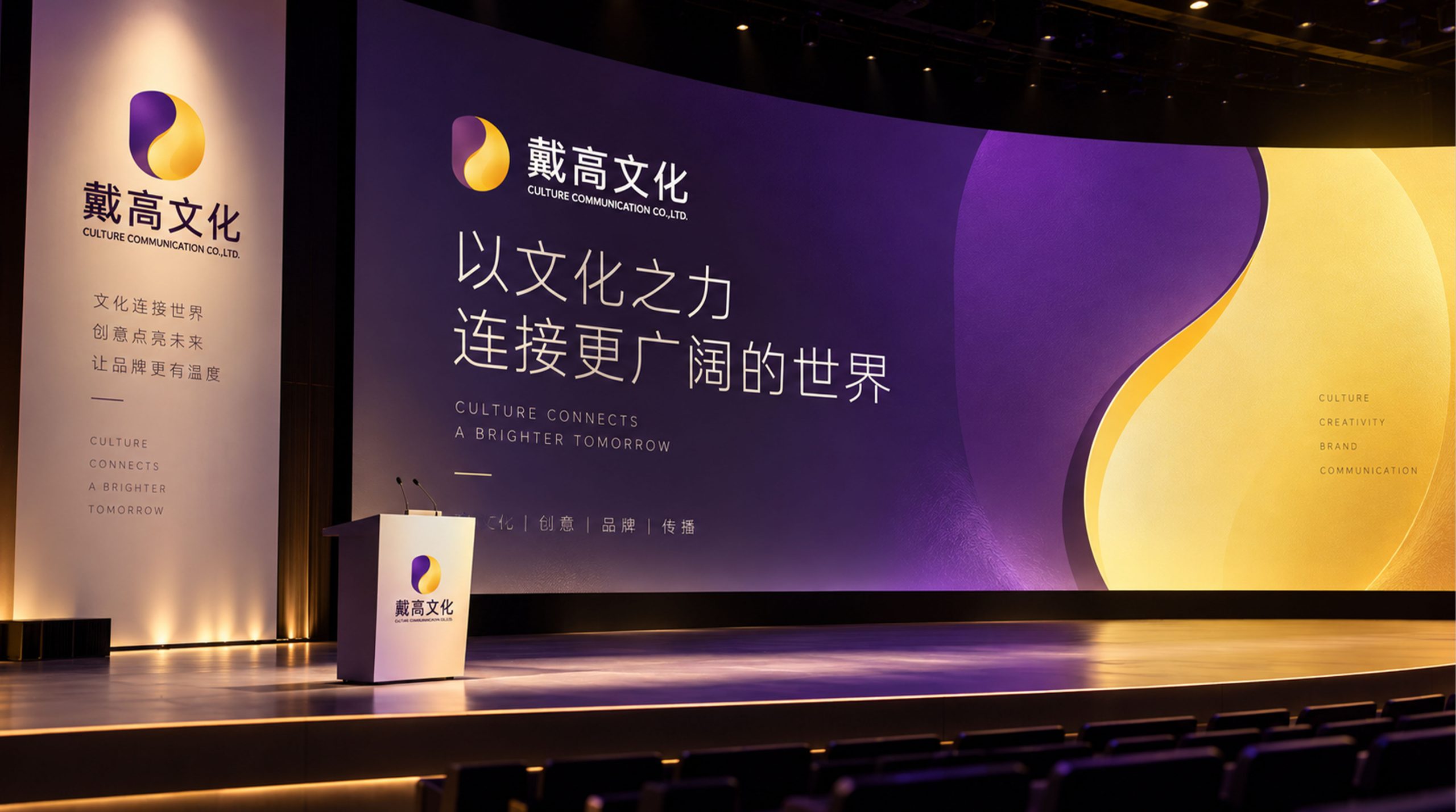
The logo can be widely used in company headquarters and creative studio logos; brand planning plans, visual design proposals and project portfolios; official websites, social media and industry work display platforms; creative industry summits, brand design competitions and cultural exchange event images. On the cover of the brand proposal, the purple gold logo is presented on the dark cover using hot stamping technology. The delicate outline of the feather pen exudes the professional taste of a cultural and creative institution in the golden luster. In the dynamic visual, the quill pen rises upright from the center of the picture, the feather arcs spread out softly to both sides, and the crown arc is elegantly completed at the end of the pen, symbolizing that Dai Gao Culture puts a crown of value on each brand with a creative pen.
brand meaning
The logo contains three core images: Creative Quill - the quill conveys the professional capabilities of the cultural and creative industry centered on writing, design and expression; Brand Crowned - the crowned arc conveys the service commitment of giving the highest value and best image to customer brands; Cultural Elegance - the purple-gold tone and exquisite shape convey the elegant aesthetics and professional taste of cultural enterprises. The overall design conveys the brand vision of "high standards and high standards".
Improper Usage (Protection Specification)
Do not change the tilt angle of the quill or the arch proportion of the crown arc; do not delete the feather arc or the extension line of the pen tip; do not change the hue of the main color of Dai Gao Purple; do not add gradients, strokes or industrial processing that is inconsistent with the cultural style; do not separate the quill and the crown for separate use; keep the white space ≥ 25% of the graphic height; the minimum display width must not be less than 25mm.
design results
After the release of the logo, Daigao Culture's brand recognition and industry reputation in the fields of brand planning and cultural communication have significantly improved. With its visual language that combines creative elegance and high-end taste, "Guan Yu's Brush" has become the core identification symbol of the brand system, showing the brand vision of "high crown and high culture".