










This project is to design the web page and multi-terminal visual system for DiDi Enterprise, aiming to jointly build the brand temperament of the platform with the efficient management of smart travel and the professional quality of corporate services.
The design goal is to present the platform's brand characteristics of "redefining corporate travel, efficiency, intelligence, and reliability" through a systematic visual structure and commercial narrative.
The overall theme is "Enterprises save money, employees save time", integrating the intelligence of technology and the warmth of service, demonstrating the professional layout and cost reduction and efficiency enhancement value of Didi Enterprise Edition as a one-stop intelligent enterprise travel management platform.
design challenge
Didi Enterprise Edition is both a digital solution for corporate travel management and a one-stop platform for business travel services. The design needs to achieve the following balance in the visual language: sense of professionalism × sense of affinity: it must reflect the professionalism and reliability of enterprise-level services while delivering a convenient and efficient user experience; sense of technology × sense of business: it must maintain the data-driven characteristics of the intelligent platform while also showing the high-end quality of business travel; sense of efficiency × sense of trust: it must not only continue the core value of cost reduction and efficiency increase, but also integrate the security and compliance needs of corporate customers. The core challenge is - how to combine the professionalism of enterprise services with the convenience of user experience in design, so that the platform has both commercial value and pleasure to use.
Strategy and philosophy
The project takes "smart efficiency·service warmth" as its core design concept. Visual philosophy: based on the dual-line logic of "professionalism and convenience" as the visual basis, reflecting the efficiency of management and the reliability of services; structural logic: using an enterprise-level SaaS product layout system to organize service information in layers to form a multi-dimensional structure of "value-product-solution-case"; color system: using Didi blue + pure white + Business gray is the main color, supplemented by data charts and functional icons, symbolizing professionalism, intelligence and trust; graphic language: integrating product interfaces, data boards, service icons and scene illustrations to establish a "visual system under the enterprise service order"; interactive expression: introducing free trials, appointment demonstrations and customer success cases, so that the platform has both conversion efficiency and trust endorsement. Core concept: Present corporate value with visual expertise, and maintain service warmth with interactive design.
Design presentation
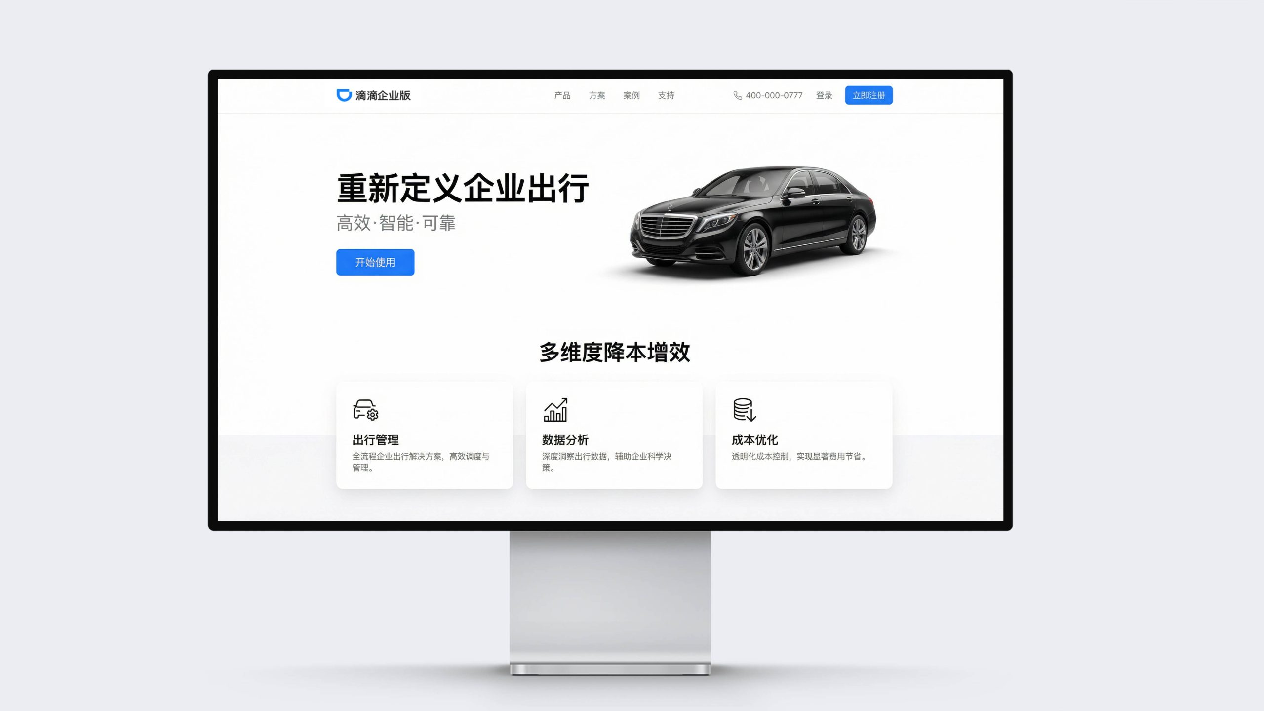
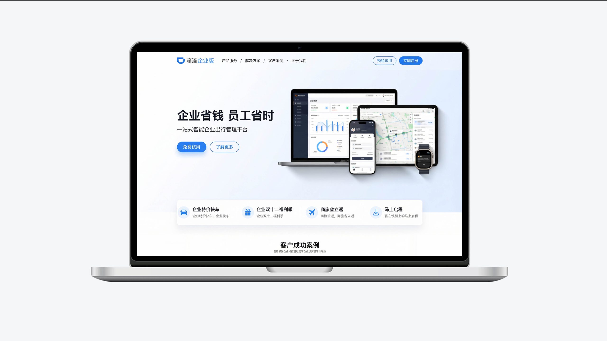
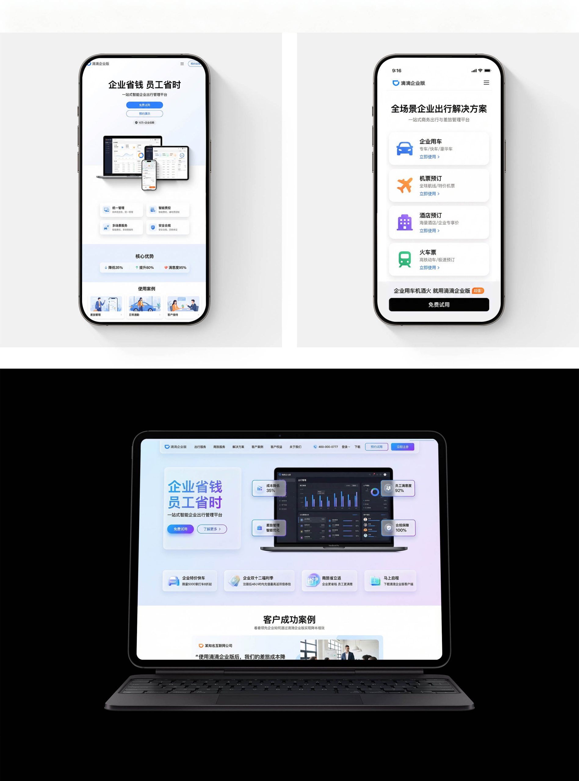
Home page design: The main color is a pure white background and Didi blue buttons, reflecting freshness and professionalism; "Redefining Corporate Travel" and business models are the visual focus at the top, supplemented by a "Start Using" conversion button; the navigation uses functional categories such as products, solutions, cases, and support to convey the corporate service pattern. Content logic: 1. Core value proposition; 2. Multi-dimensional cost reduction and efficiency improvement (travel management, data analysis, cost optimization); 3. Full-scenario solutions; 4. Customer success stories; 5. Register now.
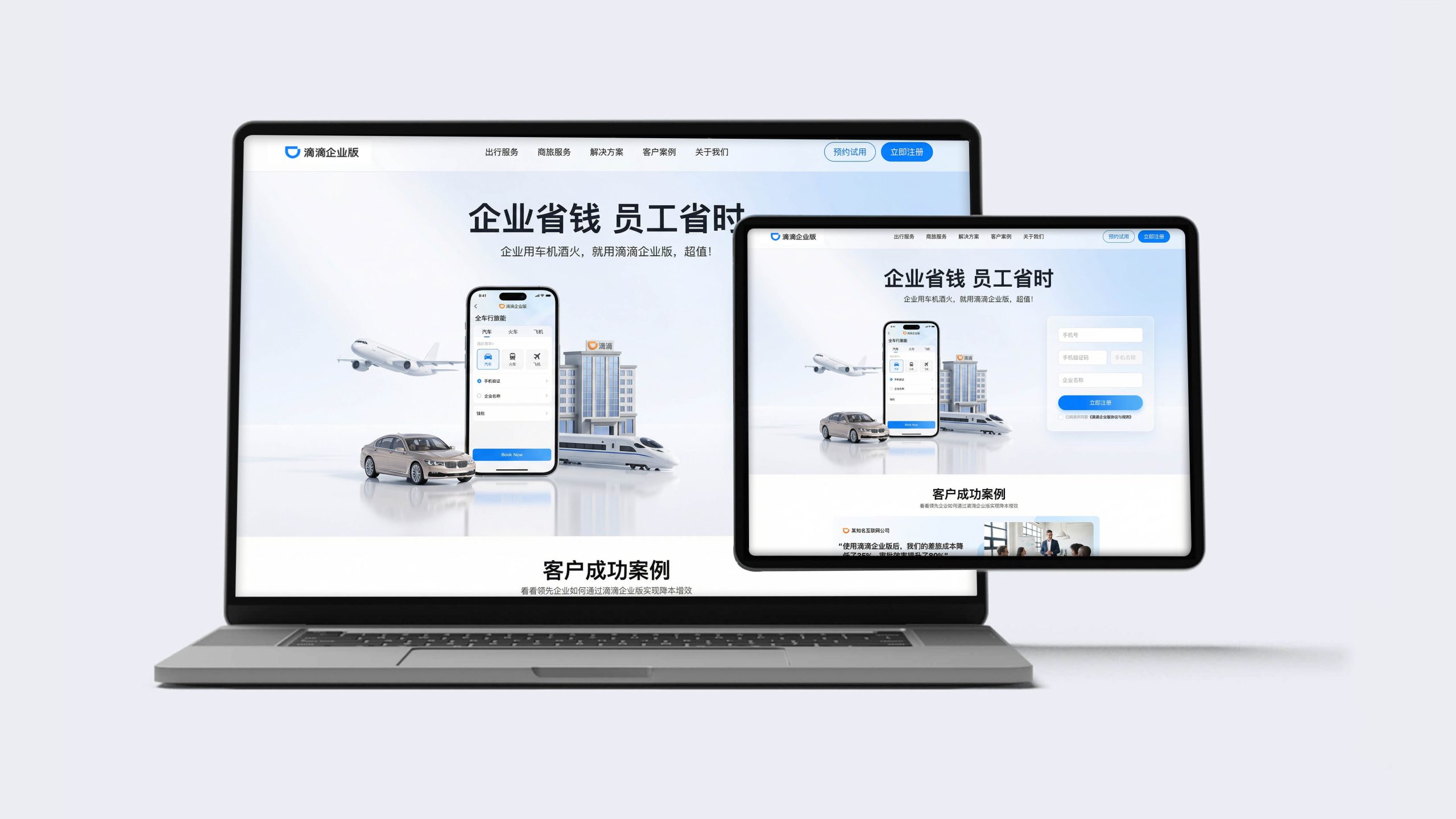
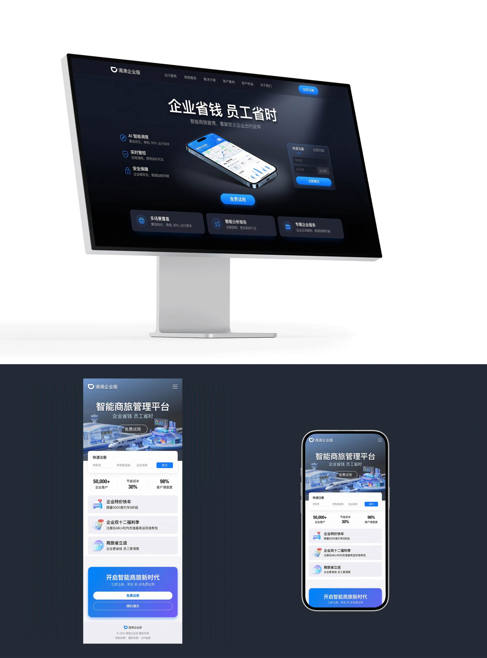
Multi-terminal design: Responsive structure: The desktop official website and mobile APP are seamlessly connected, forming a "know × use" rhythm; Functional design: Present a one-stop travel solution with four service modules: corporate cars, air ticket bookings, hotel bookings, and train tickets; Image language: Use product interface screenshots, data visualization, and multi-style content presentation of business scenarios to convey professionalism and efficiency; Case page: Introduce well-known corporate customer testimonials and cost reduction data to express the commercial value of the platform. Technology and experience: Adopt unified management backend + intelligent expense control + multi-scenario services; data reports can be visualized in real time to ensure transparent and efficient enterprise management. The overall style reflects "professional quality × intelligent efficiency × trust in service".
Achievements and Impact
As the official visual system of the platform, this design is widely used in official websites, APPs and corporate customers. Through the integration of corporate logic × service narrative × brand order, the design successfully created the visual image of Didi Enterprise Edition as "both professional depth and service warmth". The project is considered by the platform to be "one of the visual systems with the most corporate trust and conversion efficiency" and has become the core blueprint for the multi-terminal experience design of Didi Enterprise Edition.